Of the state and States of Information Disorder
MisDisMal-Edition 19
What is this? This newsletter aims to track information disorder largely from an Indian perspective. It will also look at some global campaigns and research.
What this is not? A fact-check newsletter. There are organisations like Altnews, Boomlive, etc. who already do some great work. It may feature some of their fact-checks periodically.
Welcome to Edition 19 of MisDisMal-Information

Hello, Hello!
Instead of me rambling on for anywhere between 2500 - 4000 words about what’s happening around the world in Information Disorder, this week, we’re going to try something different in this edition. Oh, I’ll still ramble. And yes, I will still talk about Information Disorder. And yes, yes, we’ll also go around the world.
Wait! How is this any different then?
It is, I promise, stay with me.
The State of Information Disorder Responses
Ok, let’s dive in. I’ve been spending some time trying to understand how various countries (~30) around the world are responding to information disorder online. Specifically
Where they perceive the threat comes from? -
What legislative approaches they are taken/have taken/are planning to take to deal with it.
What specific actions they are taking.
Now this is still a work in progress, but I am also in the process of opening it up for feedback. So there could be (some) changes between what is on this edition, and the final version that will go out in the next couple of weeks (hopefully).
Alright Prateek, enough talk.
Fine, fine. Let’s start you off with a map of the world. No need to get excited, no one is travelling anywhere just yet. I’m not including a link to it since Tableau insists on publishing an anti-national version.
I hope it isn’t too small. But, if it is - let me give you the gist. It represents the countries I looked at (in red) - with the number of actions the state has taken in response to information disorder.
For context, I identified 20. I’m not listing them and testing your patience - they will be on the one of the Tableau visualisations I’ve shared in this edition.

This is a little deceptive, since it only displays the number of actions. But the nature of those actions is highly significant as well.
Are they mandatory or voluntary?
Do they address the supply of misleading information, or the demand for it?
Who/What is expected to respond or is the target of the action. i.e. Government, Market, Society or Individuals?

The vertical axis represents whether it is mandatory (lower) or voluntary (higher)
The horizontal axis does 2 things:
It indicates if the intervention is supply side (left) or demand side (right)
Distance from the center also indicates the responder/target in the following order: Government, Market, Society and Individual. To help make this distinction clearer, these are also colour-coded.
And the size of the circles is indicative of the number of countries that are taking that particular course of action (larger = more).
Let’s look at some examples to help explain this better. Admittedly, some of this is subjective.
Arrests - Public <Bottom-Left>. Highly Mandatory. It is supply-side because such actions are targeted at individuals for “spreading” misleading information. And well, action is taken against an individual.
State run fact-checking initiatives <Top-left>. Pretty voluntary - one can choose not to engage, or ignore even after engaging. Supply side, since, it aims to correct misleading information already out there. And these are targeted at Society.
Funding Awareness Campaigns < Top-Right-ish>. Again, voluntary. If the state is offering grants to an organisation running an awareness campaign, it does have the option not to take them. Demand-side, since media literacy campaigns ultimately aim to reduce the demand for misleading information.
Is this too small too? Well, in this case here’s a link where you can interact with it directly.
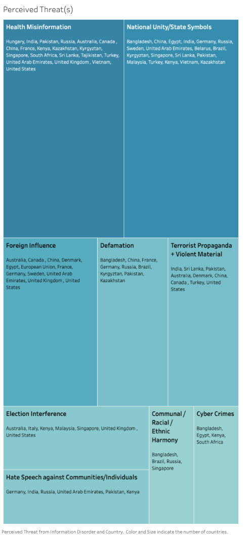
Next, let’s look at what countries perceive as areas of threat (link). In January (remember January?), it was very unlikely that Health Misinformation would be right on top - but at this point it is not very surprising that it is. I was surprised to see ‘National Unity/State Symbols’ higher than ‘Foreign Influnce’. Admittedly, though the difference in this posturing isn’t so discrete.

Let’s also look at the how countries are legislating/or using existing laws to respond (link). Note that I’ve factored in even proposed (Brazil : Anti-disinformation) or repealed (Malaysia : Anti-disinformation) laws. Why? I am interpreting this as being indicative of direction.
That Criminal Code and Election-related legislation are the top 2, isn’t that surprising. Anti-Disinformation laws seem to be on the rise though.

Alright, are you with me so far?
Now, let’s try and look at the countries in parallel. I get that the images may be too small again, but there’s a happy side-effect of that. For better or worse - it makes it easier to spot the general differences (or lack thereof) among many countries on the list.


But don’t worry, there is an interactive version too. It is a little clunky (I’m learning on-the-fly, be nice!), though it helps compare 2-4 countries side-by-side (in fullscreen) <depending on your screen-size>.
As I said, this is a work-in-progress.
If you do happen to have thoughts on what I can improve, or just want to argue about methods - feel free to reach out to me via Twitter DMs (unless you already have my email or phone number).
The Nation..er..Republic doesn’t want to be blocked
You misread that, I mean’t Republic TV.
You didn’t think I’d let you get away without some more charts and graphs did you?
Over last weekend, I noticed 2 counter narratives, opposing hashtags such as CantBlockRepublic and #BlockRepublicTV appeared to be getting a significant amount of attention. However, when I tried to pull tweets the latter returned an insignificant amount so there was really no merit in analysing them (algorithmic lesson learnt). I was able to get around 40K tweets with the hashtag CantBlockRepublic though.
Of the 1% most active accounts, significant portion of the acitivty was driven by accounts created since June 2020.

And as you go into the top 10%, 25% and 66% followed by excluding the top 10% of the most active accounts - it is interesting to note that the relative percentage activity from accounts created in August 2020 goes up.

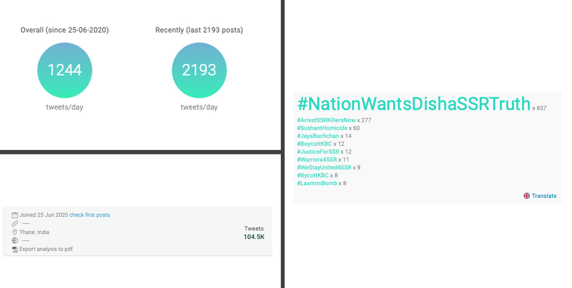
While we’re here - let’s also look at some information around the 5 most active accounts.
#1. Over 100K tweets since the account was created in late June. Most hashtags pertain to the SSR saga. Over 2000 tweets per day.

#2. Almost 10K tweets since the account was created in late July. Again, most hashtags pertain to the SSR saga.

#3. Almost 20K tweets since the account was created in Aug 2020. Location listed as U.K. And again, hashtags activity strongly linked to the SSR saga. Averages over 700 tweets per day.

#4. Nearly 31K tweets since the account was created in early July. No surprises for guessing what the hashtags indicated. Location listed as Bangladesh. Again, over 700 tweets per day on average.

#5. Finally an account that was created before June. But again, most hashtag activity is around the SSR saga.

Also, if you are in International Relations nerd - Takshashila is organising a Deep Webinar on 23rd September. You can register using the link under the image.

Register:http://bit.ly/DeepWebinar2

